How to Create Original and Unique Blog Graphics (for Beginners)
A blogger could have the most interesting post filled with actionable tips but, without quality visuals, those words may never be read by the audience it deserves to reach.
With the visual age we’re living in today, it has never been more important to create original content in order to experience growth and stand out from the crowd.
Although many might agree that making unique blog graphics is a job for professional designers, that’s NOT the case and I can’t wait to show you all why. Covering branding elements of a quality graphic and how to create unique visuals using incredible resources like visme.co, this post is for those who are ready to take their beginner design game one step higher!
gather your branding elements
One of my biggest tips for bloggers has always been to plan accordingly when creating original content. Although planning and outlining your posts is important, making a blueprint for your graphics is just as crucial to set your brand up for success.
stock photos
Capturing or downloading high-quality photos is, personally, one of the most enjoyable parts of creating a post/website. The photos we use have the power to set the tone of our content before words are even read and, in some cases, take the place of written posts altogether!
When I’m not snapping my own pictures for a post, I’m usually scouring Unsplash or StockSnap for high-quality (and free) stock photos. (You can find a longer list of stock photo websites on my Resources Page).
fonts
Although I don’t know enough about the power of typography, I do know how a beautiful font and title layout makes me feel when searching for posts to read on Pinterest. I have around 10 different fonts and styles downloaded, currently, for different purposes. Some fonts I use for bold titles and others are used for accent words that I want to stand out. (My staple ‘featured image’ shown above is a clear example).
You can find and download free fonts at Dafont or purchase your favorites to use commercially (if need be).
color scheme
One thing I love about a blog graphic is the inclusion of an accent color that matches the blog or company brand. There’s nothing like recognizing someone based off of both their font, layout, and colors used without seeing their name written all over it.
Colors not only capture our attention, but they help us categorize the images and words we see. This is why accent colors used on graphics and throughout posts are major and should be included throughout a blog to help build personality!
The design blog, Design Seeds, has been a favorite of mine since starting this blog. Not only did I find my staple blush pink HEX code using their style guides, but I was able to plug that code into the Adobe Color Wheel to find accept pinks that you see throughout this site.
create your own share-worthy graphics
I’m sure many of you would agree that actually creating visuals for your blog can be both a breeze and a headache. With the varying budgets that we all are working with and lack of funds to invest in Adobe applications or graphic designers, it’s always a plus when a website covers all the bases we need to build something we’re proud of.
Awhile back I had the honor of reviewing Visme.co in a popular post, How to Attract Your Ideal Audience, where I shared different ways one can get the RIGHT kind of blog views to their site.
While revisiting Visme for another review, I thought it would be helpful to make everyone’s life easier with a quick video walkthrough showcasing my process when creating a staple graphic.
(Check the video out below to see for yourself)!
As an incredible online design tool used by content creators from all walks of life, Visme.co is the site for non-designers looking to create professional presentations and infographics.
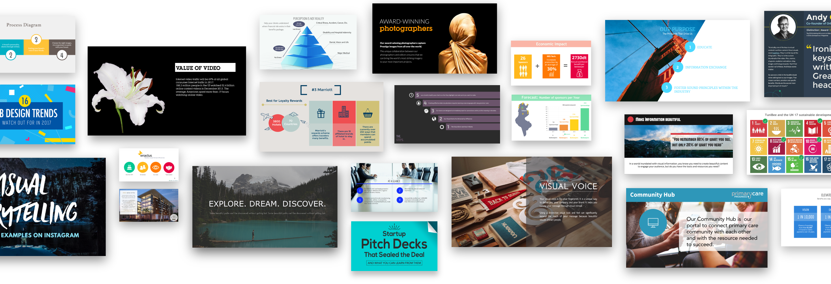
Although the video above was quick and to the point, I had a fun time searching through each folder beforehand to check out the different overlays, pictures, and text styles I could use to create something truly unique. The options were great, and practical, and everything was easy to find in the sidebar.
In my original post (linked above) I played around with the animation features and embedding those animated posts for offline viewing. This type of feature is one I genuinely haven't seen on other well-known design sites considering how easy it was to perfect after a few short minutes.
Tools like Visme are incredible time-savers with tons of flexibility for bloggers like me that created their site with ZERO graphic design experience. Not only was I able to create simple visuals for an upcoming project, but I’m in the process of planning out a new website/brand using this site for 90% of the visual work!
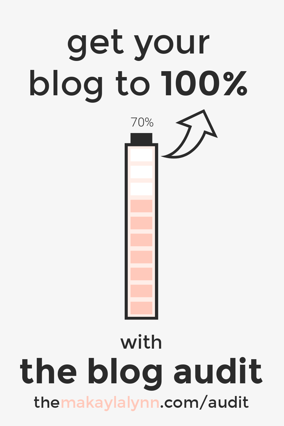
Pictured below is a visual for an upcoming service launching in May, The Blog Audit by Makayla Lynn. After looking through the many lists of elements one can use, I came across a battery overlay that was 100% customizable. Not only was I impressed, but I found tons of other customizable pre-made graphics that act as a ‘plug-and-play’ for all of us non-designers out there. (This also works great for professionals and students that need to plug in data to pre-made stat elements, graphs, or tables).
Creating quality images, being able to save all of my branding elements (fonts, colors, and links), and having tons of pre-made options to make my life easier are just a few of my favorites that I can't wait to explore further.
After having the opportunity to use and review the premium version, I highly recommend you all check out Visme to start creating your very own unique graphics using one of their 3 pricing options (starting with their basic free version).
find your signature style
After you’ve figured out the different branding elements (photos, color scheme, and fonts) and how to create the visuals you desire, there’s always the option to go the extra mile.
The extra mile, to me, is keeping a consistent style throughout your images to help your brand make a lasting impression. Believe it or not, details like text layout, accent colors, and consistent overlays play a major role in helping identify a brand and set it apart from the crowd.
Here are a couple tips when creating your own set of consistent visuals:
- Always create a blueprint of each image you use consistently for your blog/site and social media. This could include a couple mockups for Pinterest, email signups, social media quotes, and so on…
- For blog post images: include an identifiable keyword in your title and make it as noticeable as possible. This could mean bolding the text, making it a different color, or placing a line or overlay underneath.
- For content/service/product images: add a couple screenshots or mockups of what your audience will receive after signing up or downloading a service/product. (Sneak peeks are always the way to go when trying to get someone’s attention)!
- For infographics: find one element or overlay and use it in the same place throughout the graphic. If this means a circle holding a number or lines underneath certain words, people are known to gravitate towards graphics that are symmetrical and pleasing to the eye.
- Finally, refrain from having your logo or website title placed in the middle of the graphic or sized too large. The goal is the make share-worthy graphics that aren’t too distracting but recognizable enough to let people know where it comes from.
I hope this post was helpful for those that need a bit more help in the visual realm of blogging! I know firsthand what it’s like working on a project and not being confident enough in my Adobe Photoshop skills to create the graphics I can be proud of.
I’m glad I had the opportunity to revisit visme.co and share all of their helpful features with you all once again. (I’m ready to launch The Blog Audit and share all of its incredible graphics with you all soon!)
Make sure to visit my Resources Page for more resources that I use to maintain/manage this site, and check out the quick video below showcasing even MORE of Visme's features!
Keep creating, my friends, and
Live Intentionally
Miss Lynn
One Comment