5 Things Your Blog is Missing That Could Be Hurting Your Brand
Every blogger knows what it feels like to question whether or not we’re hurting our brand by doing or NOT doing certain things.
It could be not posting enough, posting the ‘right’ things, arranging our homepage in a certain way, or not doing enough to inform our audience.
No matter what we tend to worry about, one thing is certain:
Nobody is a ‘perfect’ creator with a ‘perfect’ platform.
Yes, we are creatives in our own respect, but the unique depth of this community is what makes it great regardless of what mistakes we make.
With that said, it never hurts to ask ourselves or consult our peers with ways to improve our platforms and, in this post, I want to shed some light on things your blog may be missing that could be hurting your brand. Let’s get to it!
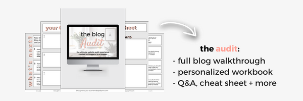
Before I get started, I wanted to finally announce my new service for bloggers, The Blog Audit!
I know what it’s like to wonder how your website is perceived from the outside looking in. Let’s face it, it’s hard to be objective with things we truly believe in, let alone an entire brand that we fearfully and passionately create.
With this audit, I want to be that informed ‘visitor’ that completes a full walkthrough of your blog to give helpful tips and honest first impressions. I’m not coming on your page to charge you for a couple minutes worth of advice and judgment, oh no…
I’m offering a 10-minute recorded walkthrough with a document answering 3-10 of your burning questions, a cheat sheet, and additional workbook pages with three different (affordable) packages to choose from.
If you're interested, I would love to be that extra voice that helps you take your platform to the next level. Read more about it here.
1. a proper navigation system
One thing I, and other fellow bloggers/blog readers, can’t stand is a difficult navigation system. You know, those bars (at the top, left, or right) on a homepage that shows you where to go or what pages are available.
More often than not, your bounce rate (being “the percentage of visitors to a particular website who navigate away from the site after viewing only one page”) depends on how easy it is to jump from section to section.
Many visitors that come to your page want to know what you offer from the jump. They want to see what you write about (your categories), if you have a shop, and what other resources you have that could benefit them (like a service, ‘free stuff’ page, and a contact form so they can reach you directly).
It benefits everyone, both blogger and visitor, to have a dedicated (and organized) navigation menu(s) visible before one is forced to scroll. This way, there’s nothing to question and lots to explore.
quick tip: I always suggest cleaning up your menus to accommodate your most popular pages. For some, this means having three links at the top of their blog to showcase a shop and service page. For others, this could be highlighting your blog categories and contact form. Everyone is unique with their own unique following. It’s up to YOU to figure out what they gravitate towards the most.
2. newsletter / community signup form
I know how annoying too many popup and sidebar signup forms can be when browsing a site. It’s tasking to click the almost invisible ‘X’ at the top of a popup and scroll past all of the squares asking to get an email and first name.
Trust me, signup forms are one of the most controversial topics in the blogging community.
Although too many are, obviously, too much, and none is too little, having at least one or two direct ways to signup for your newsletter or online community is necessary.
Believe it or not, there are people who return to your blog after a few previous visits that are ready to take the plunge and hear from you in their inbox. When this happens, there always needs to be a form in sight or easy to scroll to in order to keep their loyalty before frustration hits.
3. 'attractive' graphics
One of my favorite things about visiting other blogs is seeing how they choose to ‘beautify’ their pages. With blog graphics, logos, and other images that help set the ‘vibe,’ it’s more important than ever to get a hold on a color scheme and theme early on.
When I say ‘attractive,’ I don’t mean the opposite of ‘unattractive’ because, in my opinion, most of us showcase decently curated graphics! I say attractive in correlation to symmetry and color.
Many visitors like to see an organized homepage for the sake of their sanity. If I can be real with you, how many times have you visited a fellow blogger’s page and was immediately overwhelmed with the rainbow of colors and blurry over-stretched images?
If I know anything about the human mind, we like clean lines and bright complimenting colors. I’m not sure neon yellow and hot pink are a great combination for a blog post graphic, but hey…If your audience likes it then they like it!
Just make sure you figure out their preference and what attracts visitors (that’s key) before settling on one specific style.
4. 100% 'free' content
I know...This sounds a bit 'off,' doesn't it?
If you're confused, consider the well-known ‘resources’ page, that you can find on this site and many others, as a perfect example of what can be both a scam or a monetized ‘free’ piece of content.
I consider my own resources page a monetized and ‘free’ space for my visitors because it includes a plethora of links to helpful online tools and services with a few affiliate codes sprinkled throughout.
To me, it’s important to disregard any guilt for monetization or ad placement because, in all honesty, bloggers need to eat too. On the other hand, though, issues arise when visitors come to our pages and can’t find ONE thing that isn’t used to make a dollar.
Whether that’s too many ads placed around a homepage or few links on a resources page that all, inevitably, act as affiliate codes—it’s crucial we pay more attention to our intentions and question whether or not we would trust ourselves if we were a stranger on our website.
quick tip: Always start at an honest level to gain trust. Our readers, if they browse other pages, know the difference between “click me now” and organic content. Whether it’s with our blog posts or extra pages, make sure your value supersedes your benefit (for the sake of ‘humanity’ because nothing is wrong with earning a commission for your time)!
5. a public mission, tagline, or purpose
The last and most important thing I see missing from blogs is a public tagline or mission. It’s one thing to write down your mission statement in a journal so YOU know why you’re creating content, but it’s another to include your community in that mission.
My tagline is to ‘Live Intentionally’ and my purpose is to encourage, inform, and uplift millennial women, students, and creatives.
I’ve included this purpose in plenty of blog posts, signatures (when sending an email or message), and make sure to use trigger phrases like ‘pursue purpose’ and ‘live with intention’ so my visitors can know, immediately, what I’m all about.
If you have a hard time coming up with a tagline, don’t fret. Making your purpose clear in your about page (something you should also have that many bloggers forego), and in your sidebar underneath a picture or quote (whatever floats your boat) is more than enough.
They say 'content' is king but now, more than ever, your community is queen.
I hope this post was filled with gems that you never knew you needed! That’s why I do what I do, and why I created my new Blog Audit service. I’ve been working on that project for far too long and can’t believe I can finally say it’s available for pre-order and officially live on July 3rd, 2018. (If you’re reading this after, go check it out!)
quick tip: The fact that you're still reading makes you a real one! For this, go ahead and take 10% off with the code: earlybae before the July 3rd launch date and, from blogger to blogger, always remember that the journey you’re on is filled with lessons, failures, and successes for a reason.
This entire blogging journey is about learning enough to share, and sharing enough for the next generation to learn.
This entire blogging journey is about learning enough to share, and sharing enough for the next generation to learn. Share on X
Live Intentionally, my friends,

Such great tips!
Glad they were helpful! ❤️
Great post. Love the focus on building a community and having a solid navigation!
Yes! So important!
I so need to be working on my newsletter, it’s so important!!
xo, Sydney
anchoredinthesouth.com
Great post! if I can’t find an easy navigation menu on a website I usually give up and click on to the next one.
I find myself doing the same!